Home
Contact
Resume
Examples of Work
Print Media
Web Media
Identity
D&D Critter Care
The Write Way
SSB ID Guidelines
Arboreal
Imperium Computers
Packaging
Photography
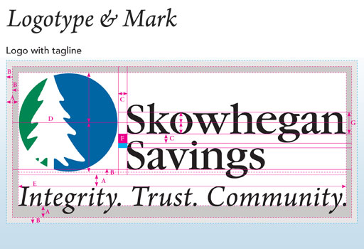
Skowhegan Savings Bank ID Guidelines
Guidelines and rules on the proper way to use the Skowhegan Savings Logo